Landing pages are a critical part of the sales funnel. They nudge users along the funnel and are designed to increase conversions and signups. The reason why it’s called a landing page is that it’s designed for users who “land” on the page through an email campaign, an external ad, or some other source of traffic.
When you create a landing page for a client, the discussion will eventually veer towards conversion rates. If you pour hours and hours into a landing page design, but it fails to increase conversions, what’s the point? Creating high-converting landing pages is not an exact science; it’s an art.
It requires a careful understanding of your audience, and where they are coming from. Generally, people will visit your landing pages either from organic search results or via a marketing campaign. They are interested in what you have to offer but need a bit more information.
So, the entire purpose of the landing page is to convince the user to pull the trigger. It could be used for lead generation, or for getting more signups or conversions. Here are 10 key elements to integrate into your landing page design if you want to increase conversions.
Table of contents:
- Start With a Catchy Headline
- Attention-Grabbing Graphics
- Well-Written Copy
- Identify & Highlight Pain Points
- Add The Video
- Rigorous A/B Testing
- Social Proof
- FAQ Section
- Clear Offer
- Enticing Call To Action (CTA)
- 5 Examples of High-Converting Landing Pages
- Conclusion
1. Start with a Catchy Headline

A catchy headline goes a long way in convincing people to stay on the landing page. Essentially, a catchy headline is designed to grab the viewers’ attention right off the bat. It resonates with them, and it’s designed to stick in their minds even after they close the website.
This is the first thing that a user will see when they land on your page. Only 2 out of 10 users will ever bother reading the copy on your landing page, so the heading needs to be really intriguing.
There are several kinds of headlines that every writer should know about. These include:
- Kicker headlines – designed to provoke interest
- The “How-To” headline
- The Incentivized headline – see the example below
- The Problem Headline – “Tired of X? We have a solution!”
- The Call to Action – designed to convince users to act
Here’s an example of an incentivized headline:

Remember, the person is already interested in what you have to offer; they just need a bit more information!
Here’s a simple formula that you can use to come up with a catchy headline:
- Check your competition
- Do the keyword research
- Write at least 5 creative variations of the headline
- A/B test your headlines carefully to determine what works and what needs to be ditched
- Don’t write overly long headings.
2. Attention-Grabbing Graphics
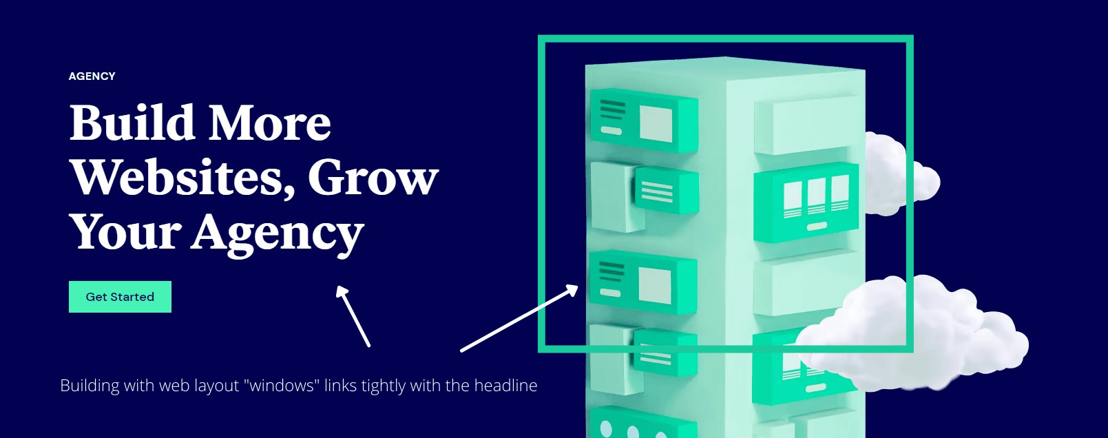
The graphics you use on the landing page design play a bigger role than you might think. Visitors on the site aren’t exactly interested in reading batches of text; they are more concerned with how it’s presented. Using graphics to drive your point will resonate with the user much better.
For instance, the screenshot above is from Elementor, and they use graphics very effectively to highlight how their product helps digital agency owners. Their landing page for agencies is riddled with graphics and designs created using Elementor, thus adding value and showcasing what the product is all about.
As the name suggests, attention-grabbing graphics are designed to immediately hijack the viewers’ attention. They often feature a conceptual twist designed to invoke a surprise reaction, and usually target the way people perceive different images.
In order to create interesting graphics, you need to create links between the thoughts in your viewers’ minds. It should link closely with the copy too. Ideally, you will want to work with a graphic designer to come up with such imagery.
However, that doesn’t mean you can’t design them on your own. Here are a few resources that you can use to create attention-grabbing graphics:
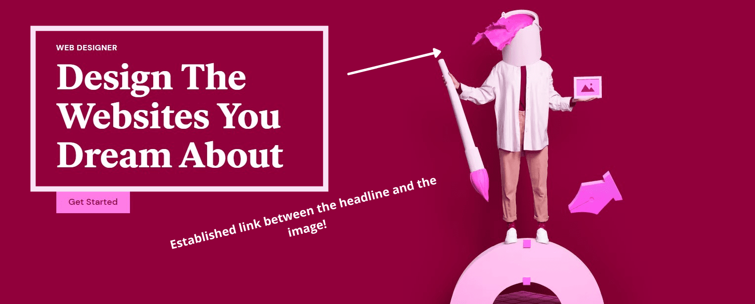
The best way to use these graphics is to link them closely with the headlines. You’re taking your visitors on a journey, so it’s important that you establish a link between the graphics and the content, as shown below.
3. Well-Written Copy

When writing copy for your landing pages, always focus on presenting the value in as few words as possible. If you take a look above, MailChimp has written excellent copy for their personalized email builder. They highlight the pain point and then present the solution.
It’s simple, it’s effective, and above all, it highlights the value addition perfectly. Landing page copy should touch on your users’ pain points, and address them to the point. There’s no reason to beat around the bush.
Here’s how to write good copy:
- Do the keyword research and include focus keywords and secondary keywords.
- Write as you talk.
- Highlight the pain points (exaggerate the common problem)
- Present the solution of the problem through your product
- Think “What’s in it for the user?”
- Make sure to include all benefits of having your product
- A/B testing!
Well-written copy doesn’t have to exude style. It’s essentially copy that builds trust, showcases authority, and above all, encapsulates the value you offer briefly. The best way to write a good copy is to use the 4Cs formula: make it clear, concise, credible, and compelling.

Another way to write good copy is to tell a captivating story. If it resonates with your audience, they’ll be hooked!
However, many people make basic mistakes when writing copy.
Here are a few mistakes that you should avoid at all costs:
- Not proofreading your copy.
- Not adding a clear CTA.
- Focusing more on the product instead of the value it offers.
- Deviating focus
- Not writing catchy headlines
4. Identify and Highlight Pain Points
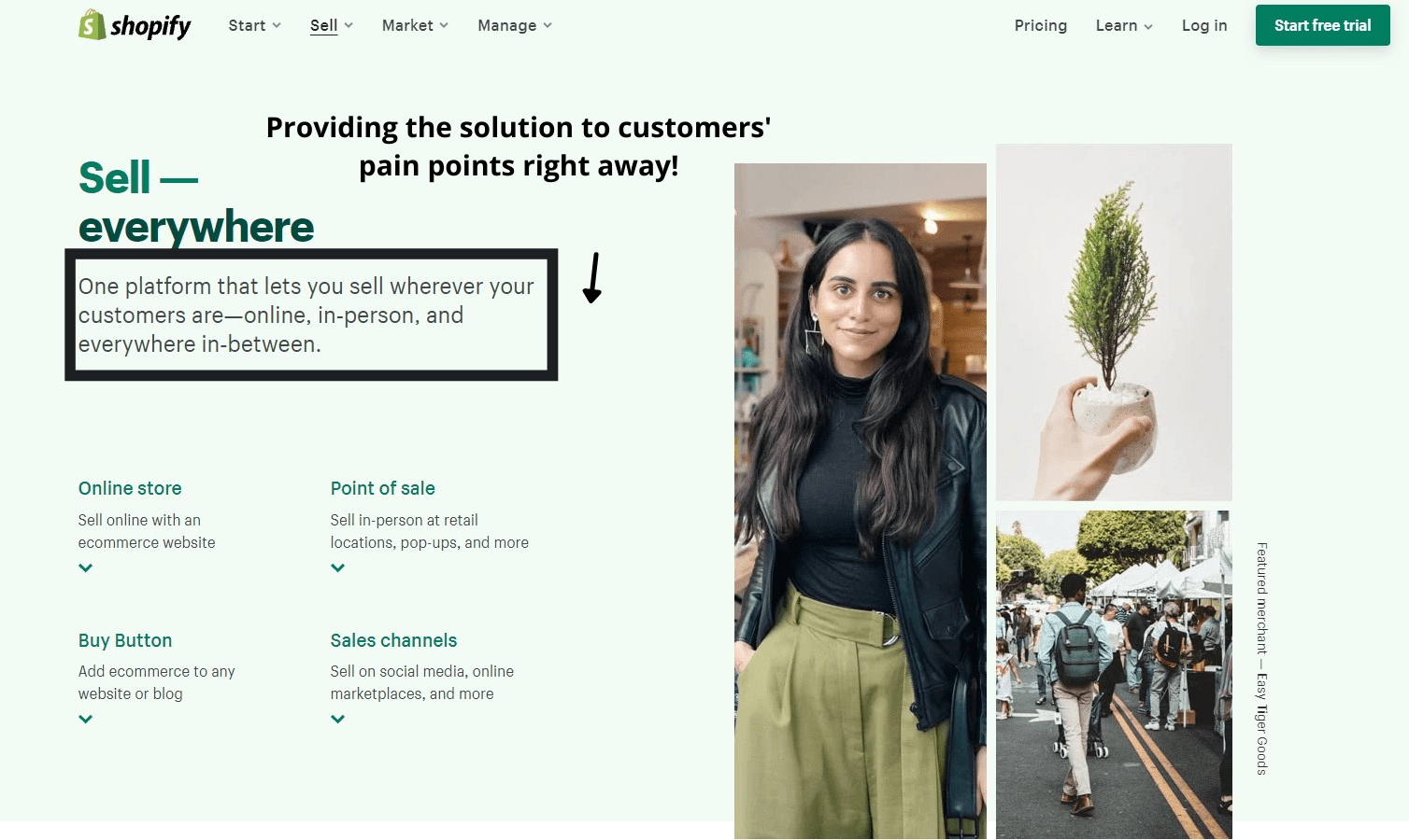
Shopify is a hosted eCommerce platform that gives its users all the tools that they need to launch an online store. It takes away the hassle, allowing users to employ simple drag-and-drop techniques to create and launch their store.
They understand their market very well, and they know their users’ common problems. That’s why their landing pages almost invariably start by identifying and highlighting their users’ pain points and then present the solution.
Here’s another great example of a landing page where the creator is highlighting pain points and providing solution right away:

A pain point is simply a common problem experienced by your audience. Knowing pain points is important because it allows you to position your offering as a prospective solution.
Here are five examples of pain points from different industries:
- Delayed response from support teams
- Overly complicated sign-up processes
- Inconvenience in using a particular service or product
- Excessive time is taken to complete simple tasks
- Information not readily available.
To find your customers’ pain points, you need to first develop a sound understanding of your audience in general. You need to know the main issues that lead to friction, and how to resolve them.

This point ties closely with the previous one; you can’t write good copy if you don’t touch on your audience’s pain points and identify the solutions they want. Make sure you create a link between the two.
5. Add The Video

Adding a video on a landing page is another effective way to reduce bounce rates and get people to convert. Landing page videos are ideal for highlighting the features and presenting your product in an informative and engaging way.
If the conversions from your landing page don’t meet your expectations, adding a landing page is a great idea. You can either add a brief video that explains the main features of the program or service, or, you can create an explainer video highlighting the problem, and the solution you offer.
When done correctly, videos on the landing page can definitely increase conversion rates. However, just make sure that you don’t add an overly lengthy video. You don’t want the video to be more than 2 minutes, tops.
Here’s the most effective video structure that you can use on your landing page:
- A brief introduction – Here, you can talk about how you came up with the idea of the product or service. Keep it short.
- Pain point – Elaborate on the pain points of your audience. If you were experiencing a similar problem, highlight that too. Don’t spend too long highlighting problems.
- The solution – This is the most important section. Run through the features and benefits. This should take up most of the time.
- Conclusion – End the video with a logo of your company and the CTA.
Visual effects play an important role, and people are generally more interested in watching things instead of just going through the text. An average human has an attention span of around 8 seconds, which is less than a goldfish!

When creating a video, don’t just have someone stand before a camera and talk about the features. You need to show your users how the product can help.
Here at Atarim, we do this to great effect; we highlight the main features of our agency management software, letting viewers run through the main benefits through a video clip.
Also, you don’t want the video to be overly long, because nobody will stick around for 5-10 minutes to watch a presentation on a landing page.
6. Rigorous A/B Testing

A/B testing is essential if you want to know what works and what needs to be removed from your landing pages. Known commonly as split testing, this is a process where you test two versions of the same page on different audiences, and then see which one works.
Also known as split testing, this is just a randomized way of testing two or more variants of a landing page, or specific elements on the landing page. A/B testing can help you figure out which landing page your audience likes more. You can A/B test almost any element on the landing page, including:
- Copy
- Pictures
- Headlines
- Folds
- Icons
- Headers
- Pop-ups
- Videos
There are mainly three types of A/B tests, including:
- Standard split testing – comparing two different designs
- Multivariate testing – similar to A/B testing, except a higher number of variables are tested
- Multi-page testing – changes are made to several pages, instead of just one
There are plenty of tools that you can use to conduct A/B testing. Common examples include Google Optimize, Freshmarketer, and CrazyEgg. In fact, one of the biggest examples of effective A/B testing was set by Google, when the company famously tested 41 shades of blue to see which one performed better!
If you have invested a considerable amount of time and effort in creating a landing page, you also need to know whether it’s good enough or not. That’s why A/B testing is so important.
Successful marketers rigorously use split testing to remove elements that don’t resonate with their audience. It ultimately helps them build a landing page that’s primed for maximum conversions.
Bear in mind that you will need good traffic on your landing page in order to execute proper A/B testing, as without the traffic the data you’ll get will not be trustworthy.
7. Social Proof
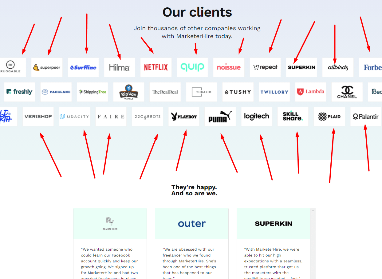
MarketerHire uses social proof on their landing page to increase conversions on their landing page. They have logos of all the big brands that have used the platform, and then some personalized quotes from people who have reaped the benefits of their services.
Social proof is simply a phenomenon where people tend to copy the actions of others. If you add testimonials on your website from others, it’ll probably encourage more people to give your product a try. The most common types of social proof include:
- Case studies
- Testimonials
- Reviews on multiple platforms
- Trust badges and icons
There’s little doubt in the fact that social proof works. When a user is on the fence about whether to sign up or not, social proof can sway their decision in your favor. It shows them that your page isn’t just full of marketing claims; there’s actual weight behind what you have written.
One mistake to avoid is to use fake social proof on your landing pages. You really don’t want to do that. Here’s why:
- Real audiences can identify fake social proof very easily,
- It’ll shred your credibility with your audience,
- It’s illegal,
- It’s just not needed.
If you want social proof, just approach your customers via email or through any other channel, and ask them to write a couple of lines about their experience. You can also use software to get social proof, such as:
- WPForms
- TrustPulse
- OptinMonster
Here’s how we use social proof on our website:

Sharing real experiences from real customers is always an excellent discussion. It helps build trust, and it shows that you value your clientele.
8. FAQ Section

Adding a bunch of FAQs at the bottom of your landing page is also an excellent way to increase conversions. Prospects won’t always bother contacting you on live chat or sending a message. If you are able to provide an answer to a potential question right on the landing page, that will most definitely increase the conversion!
You need FAQs on the landing page so that your viewers have all the information they need before they decide to convert. Ideally, you don’t want the FAQ page to contain more than 10-15 questions at most. To save space, you might want to create drop-down FAQs as shown above.
It may not seem like it at first, but creating an effective FAQ page can help increase conversions, especially amongst customers who are on the fence about whether to buy or not. The purpose of the FAQ is essentially to provide all the relevant information to your audience before they decide to buy your product or service.
Here are a few tips to create a well-rounded FAQ page:
- Make a list of your customers’ most frequent questions.
- Conduct surveys to find out what confuses most customers.
- Analyze your plans to figure out what information you haven’t added.
- Write questions based on your findings, and answer them in a succinct manner.

It shows that you are thoughtful and care about what your customers have to say. By now, you should be able to identify a sort of trend with all of these tips: present all the information that your users might need in a concise manner.
That is the core purpose of the landing page; to paint your product or service in a good light and highlight the need for it. Each element (and its positioning) must be carefully thought out. It should be presented in a sequence, which will eventually lead to a conversion.
Ideally, you’d want to position your FAQs at the end of the landing page and follow it up with a CTA.
9. Clear Offer

Take a look at the landing page above. It doesn’t get any clearer than this, does it? When designing your landing page, don’t forget the star of the show: your offer. Why would someone be interested in giving you their email address? What’s in it for them?
Try to keep your offer as simple as possible. If you are offering a discount, mention the amount. In the screenshot above, Brian mentions that the tips are “only for email subscribers.” He specifies the audience, with the offer being “exclusive SEO tips.”
Ideally, you’d want to repeat the offer at least 3-4 times on the landing page. Try to exaggerate the offer by highlighting the opportunity cost – what the user is missing out on if they don’t convert.

You need to drill down on the point repeatedly, but make sure you present it in a clear, concise manner, right off the bat. People like being given information quickly on the web. They don’t like having to scroll down to find what’s in it for them. Don’t make them wait!
10. Enticing Call to Action (CTA)

ConvertFlow’s landing page adds the CTA smack dab in the middle, and it efficiently outlines the value proposition in a mere five words. That’s all it takes. You need to do the same. If you want to increase your conversion rate, you need to come up with an enticing call to action.
A call-to-action can be an image or a one-liner that prompts visitors to act. Good CTAs are short and don’t ask much of their viewers. Ideally, you’d want to ensure that the CTA remains uniform throughout your landing page.
Remember, the core purpose of the landing page is to convert users. A uniform CTA is necessary for that. Don’t use different CTAs throughout the landing page – it deters viewers’ attention.

Add the CTA several times throughout the landing page. Just make sure that the CTA isn’t overly long: it should be between 15-18 characters at most.
Here are a few things to keep in mind when creating the CTA:
- Use action words (join today, give it a try, use the free option!
- Come up with an interesting CTA button
- Run A/B tests to find the best-performing CTA buttons.

Run A/B tests to see which one performs better than others and go with that. It’s important that you work with an experienced copywriter to come up with an enticing call to action for your landing page. This is the last nudge that your users need to eventually convert.
5 Examples of High-Converting Landing Pages
Now, here are five examples of high-converting landing pages designed by some of the top companies in the world.
1. Atarim.io
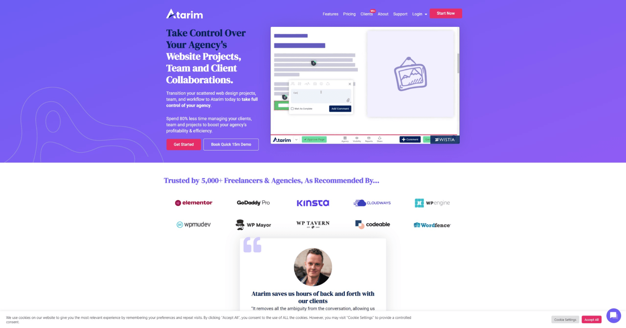
Atarim is agency management software designed to help owners manage tasks and collaborate with clients effectively. We have carefully crafted our landing page to highlight the key features of our product.
Atarim was designed to streamline client collaboration, and that’s something we repeatedly mention on the landing page. We save 80% of users’ time in managing projects, helping them focus on things that increase profitability.
On our landing page, we run through our Agency Dashboard, which brings all open tasks and requests on one page. We highlight the ease with which agency owners can manage everyday operations and also showcase the range of apps with which Atarim can integrate via Zapier.
2. Zoho Mail

Zoho offers a vast suite of B2B apps to its users. Their landing page for Zoho Mail is an excellent example of a high-converting landing page. They give you the option of signing up quickly, and also have a video with a preview, showing how it works. Within a few seconds, they present every salient feature of their email service.
3. Mixpanel
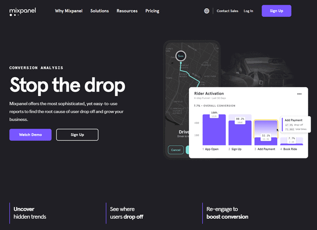
Mixpanel is an analytical platform that you can use to see user journeys on your website. Their landing page is also a great example as it integrates all of the main elements highlighted above. They use contrasting colors to draw attention to specific sections of their page, and each fold highlights a specific benefit of the platform.
It’s intuitive and designed with a user-first approach.
4. BigCommerce

BigCommerce’s landing page for B2B clients packs a strong punch, highlighting all the main features that the platform has to offer, along with strong imagery that’s bound to resonate with their audience. They also list down key features and double down on how they benefit their customers, instead of just focusing on generic descriptions.
5. AWeber

AWeber’s one of the oldest email automation tools out there. They use video, engaging copy, and catchy headlines to fantastic effect, showcasing all of the key features in the first fold only. They use sentences like “nerd out on reports and analytics,” which shows a thoughtful approach to content in general.
It’s not rigid and conveys the message without relying on heavy words.
Conclusion
Landing pages play an essential role in your business growth as they serve the purpose of showcasing your product in the best possible way.
If you follow this guide carefully and implement the strategies and techniques we showed you, we’re certain your landing page will convert well.
On the other hand, if your landing pages are underperforming, you need to first figure out why. Go through detailed reports to identify where users are dropping off. Implement a heatmap to see what elements need to be switched out, and then test them regularly.
If you haven’t implemented any of these key elements into your landing pages, it’s time to get cracking! Once you do, track the performance of your landing pages carefully, and see your conversion rate skyrocket!

