


Our six senior AI creative experts strategise, advise and review your work, right on the page. Just like a real team.
Improving design in 2026 is rarely about finding a better color palette or a more trendy font. It is about closing the widening gap between the pristine vision in a Figma file and the live, interactive reality users experience in the browser. The biggest barrier to exceptional design is not a lack of talent. It is the friction of collaboration, the ambiguity of feedback, and the technical debt that accumulates during the "review-tweak-repeat" cycle.
To genuinely improve design outputs, teams must stop treating design as a static handoff. They must start viewing it as a continuous, collaborative system. This requires a workflow that catches accessibility issues before code is written, optimizes for modern performance metrics like Interaction to Next Paint (INP), and ensures every stakeholder is looking at the same reality.
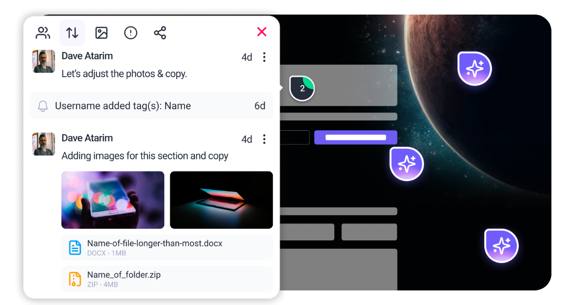
This is where Atarim transforms the process. Instead of decoding vague email chains or organizing scattered screenshots, Atarim places your team directly on the live canvas. By overlaying feedback on the actual website, you eliminate the guesswork that causes design drift. With the InnerCircle, your suite of specialized AI experts, you gain always-on guardians. Agents like Pixel monitor visual alignment while Navi proactively scans for accessibility risks. This allows you to improve design quality iteratively and collaboratively, ensuring the final product matches the initial promise.
Before you can improve design, you must diagnose the specific failures in your current output. A design that looks beautiful on a retina display but fails accessible navigation tests is a failed design. Improving design requires a structured audit of three distinct layers. You must evaluate the visual surface, the underlying usability, and the technical performance that powers it.
This category covers the arrangement of elements to guide user attention and the integrity of your design system. You are looking for inconsistent spacing, broken alignment, and "drift" from your established guidelines. In modern workflows, consistency is managed through Design Tokens. These tokens ensure that a change in one component propagates correctly across the entire site. If your buttons have five different shades of blue or your padding shifts arbitrarily between sections, your design lacks the structural integrity required for scale. You need to check if your spacing follows a mathematical scale or if it is arbitrary. You need to verify that type styles are used for their intended purpose rather than just for their look.
Responsiveness goes beyond simple "mobile-friendliness" or stacking columns for smaller screens. It analyzes how the interface responds to user input in real-time. Does the menu open instantly? Do touch targets meet the 44×44 CSS pixel minimum required for comfortable tapping? This category now heavily weighs Interaction to Next Paint (INP). This Core Web Vital measures the latency of every tap, click, and key press. A design that feels sluggish destroys user trust faster than one that looks slightly outdated. You must audit the time between a user’s intent (the click) and the interface’s response.
setTimeout or requestIdleCallback to yield control back to the main thread during expensive operations. Large calculations should be moved to a Web Worker.color-mix() or relative color syntax to darken your brand color specifically for text usage without changing the core brand palette manually.<link rel="preload" as="font"> for the primary font files used above the fold.font-display: swap or font-display: optional in your CSS @font-face declaration.ascent-override, descent-override, and size-adjust within the @font-face rule. This forces the fallback font (e.g., Arial) to take up the exact same physical space as your custom font, so when the switch happens, the layout does not move at all.--space-sm, --space-md, and --space-lg.text-wrap: balance for headlines. This prevents “orphans” (single words on a new line) and balances the text block automatically.grid-template-rows: subgrid (now widely supported) to align cards in a row based on their content height. This ensures buttons at the bottom of cards always line up, regardless of how much text is in the card body.@container logic to allow components to rearrange themselves based on their available space rather than just the screen width.#0055ff into your CSS, you define a token named color-primary-action. This token is stored in a JSON file that feeds both your Figma library and your codebase. When you update this token to a new shade, every button, link, and border using that token updates instantly across your entire platform. This bridges the gap between design files and code repositories. It eliminates the “find and replace” drudgery and ensures 100% consistency between design and code. It allows for instant theming or dark mode implementation by simply swapping the token set. rem, vw) instead of fixed pixels. Ensure your media queries cover all intermediate breakpoints, not just standard iPhone sizes. 

| Cookie | Duration | Description |
|---|---|---|
| __stripe_mid | 1 year | This cookie is set by Stripe payment gateway. This cookie is used to enable payment on the website without storing any patment information on a server. |
| __stripe_sid | 30 minutes | This cookie is set by Stripe payment gateway. This cookie is used to enable payment on the website without storing any patment information on a server. |
| cookielawinfo-checkbox-advertisement | 1 year | The cookie is set by GDPR cookie consent to record the user consent for the cookies in the category "Advertisement". |
| cookielawinfo-checkbox-analytics | 11 months | This cookie is set by GDPR Cookie Consent plugin. The cookie is used to store the user consent for the cookies in the category "Analytics". |
| cookielawinfo-checkbox-functional | 11 months | The cookie is set by GDPR cookie consent to record the user consent for the cookies in the category "Functional". |
| cookielawinfo-checkbox-necessary | 11 months | This cookie is set by GDPR Cookie Consent plugin. The cookies is used to store the user consent for the cookies in the category "Necessary". |
| cookielawinfo-checkbox-others | 11 months | This cookie is set by GDPR Cookie Consent plugin. The cookie is used to store the user consent for the cookies in the category "Other. |
| cookielawinfo-checkbox-performance | 11 months | This cookie is set by GDPR Cookie Consent plugin. The cookie is used to store the user consent for the cookies in the category "Performance". |
| elementor | never | This cookie is used by the website's WordPress theme. It allows the website owner to implement or change the website's content in real-time. |
| PHPSESSID | session | This cookie is native to PHP applications. The cookie is used to store and identify a users' unique session ID for the purpose of managing user session on the website. The cookie is a session cookies and is deleted when all the browser windows are closed. |
| viewed_cookie_policy | 11 months | The cookie is set by the GDPR Cookie Consent plugin and is used to store whether or not user has consented to the use of cookies. It does not store any personal data. |
| wordpress_test_cookie | session | This cookie is used to check if the cookies are enabled on the users' browser. |
| Cookie | Duration | Description |
|---|---|---|
| aka_debug | session | This cookie is set by the provider Vimeo.This cookie is essential for the website to play video functionality. The cookie collects statistical information like how many times the video is displayed and what settings are used for playback. |
| bp_user-registered | 13 years 8 months 8 days | This cookie is used to set which users can access the private pages of the website. It is a functional cookie. |
| bp_user-role | 13 years 8 months 8 days | This is a functional cookie. It is used to set restriction to the user on acessing certain pages like back office, account page etc. |
| bp_ut_session | 13 years 8 months 8 days | This is a functional cookie. This cookie is used to set restriction to the user on acessing certain pages like back office, account page etc. |
| player | 1 year | This cookie is used by Vimeo. This cookie is used to save the user's preferences when playing embedded videos from Vimeo. |
| Cookie | Duration | Description |
|---|---|---|
| _fs | 16 years 4 months 18 days 5 hours 26 minutes | This cookie is provided by Google Tag Manager. This cookie is used for collecting information on user preferences and the behaviour with web campaign content. This is used by website owners for promoting products and events. |
| Cookie | Duration | Description |
|---|---|---|
| _ga | 2 years | This cookie is installed by Google Analytics. The cookie is used to calculate visitor, session, campaign data and keep track of site usage for the site's analytics report. The cookies store information anonymously and assign a randomly generated number to identify unique visitors. |
| _gat_gtag_UA_187048114_1 | 1 minute | This cookie is set by Google and is used to distinguish users. |
| _gid | 1 day | This cookie is installed by Google Analytics. The cookie is used to store information of how visitors use a website and helps in creating an analytics report of how the website is doing. The data collected including the number visitors, the source where they have come from, and the pages visted in an anonymous form. |
| _hjAbsoluteSessionInProgress | 30 minutes | No description available. |
| _hjFirstSeen | 30 minutes | This is set by Hotjar to identify a new user’s first session. It stores a true/false value, indicating whether this was the first time Hotjar saw this user. It is used by Recording filters to identify new user sessions. |
| _hjid | 1 year | This cookie is set by Hotjar. This cookie is set when the customer first lands on a page with the Hotjar script. It is used to persist the random user ID, unique to that site on the browser. This ensures that behavior in subsequent visits to the same site will be attributed to the same user ID. |
| _hjIncludedInPageviewSample | 2 minutes | No description available. |
| CONSENT | 16 years 4 months 18 days 5 hours 24 minutes | These cookies are set via embedded youtube-videos. They register anonymous statistical data on for example how many times the video is displayed and what settings are used for playback.No sensitive data is collected unless you log in to your google account, in that case your choices are linked with your account, for example if you click “like” on a video. |
| vuid | 2 years | This domain of this cookie is owned by Vimeo. This cookie is used by vimeo to collect tracking information. It sets a unique ID to embed videos to the website. |
| Cookie | Duration | Description |
|---|---|---|
| _fbp | 3 months | This cookie is set by Facebook to deliver advertisement when they are on Facebook or a digital platform powered by Facebook advertising after visiting this website. |
| fr | 3 months | The cookie is set by Facebook to show relevant advertisments to the users and measure and improve the advertisements. The cookie also tracks the behavior of the user across the web on sites that have Facebook pixel or Facebook social plugin. |
| IDE | 1 year 24 days | Used by Google DoubleClick and stores information about how the user uses the website and any other advertisement before visiting the website. This is used to present users with ads that are relevant to them according to the user profile. |
| test_cookie | 15 minutes | This cookie is set by doubleclick.net. The purpose of the cookie is to determine if the user's browser supports cookies. |
| VISITOR_INFO1_LIVE | 5 months 27 days | This cookie is set by Youtube. Used to track the information of the embedded YouTube videos on a website. |
| YSC | session | This cookies is set by Youtube and is used to track the views of embedded videos. |
| yt-remote-connected-devices | never | These cookies are set via embedded youtube-videos. |
| yt-remote-device-id | never | These cookies are set via embedded youtube-videos. |
| yt.innertube::nextId | never | These cookies are set via embedded youtube-videos. |
| yt.innertube::requests | never | These cookies are set via embedded youtube-videos. |
| Cookie | Duration | Description |
|---|---|---|
| _bento_session | 7 days | No description |
| bento_events | 17 hours | No description |
| bento_visit_id | 5 hours | No description |
| bento_visitor_id | session | No description |
| GetLocalTimeZone | session | No description |
| gist_id_jquk4gak | 1 year | No description |
| gist_identified_jquk4gak | 1 year | No description |
| gscs | never | No description available. |
| jilt_customer_session_id | never | No description available. |
| jilt_utm | 7 days | No description |
| loglevel | never | No description available. |
| m | 2 years | No description available. |
| sync_active | never | No description available. |
| undefined | never | No description available. |
| wordpress_87c01d6ccf9faf56036dce5d241c08ac | past | No description |
| wordpress_logged_in_87c01d6ccf9faf56036dce5d241c08ac | past | No description |
| wordpress_sec_87c01d6ccf9faf56036dce5d241c08ac | past | No description |
| wordpresspass_87c01d6ccf9faf56036dce5d241c08ac | past | No description |
| wordpressuser_87c01d6ccf9faf56036dce5d241c08ac | past | No description |
| wp-postpass_87c01d6ccf9faf56036dce5d241c08ac | past | No description |
| wp-settings-0 | past | No description |
| wp-settings-time-0 | past | No description |