


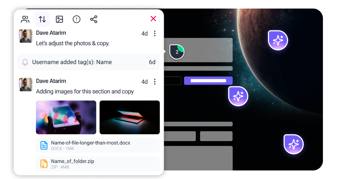
Our six senior AI creative experts strategise, advise and review your work, right on the page. Just like a real team.
User experience (UX) in 2026 is no longer just about “delighting” the customer. It is a game of millimeters where trust is won or lost in milliseconds. With the average human attention span for a loading website dropping below two seconds and mobile traffic accounting for 60.5% of total global visits, the bar for acceptable UX has never been higher. Improving user experience today requires a shift from subjective design choices to objective, performance-driven optimization that prioritizes speed, accessibility, and clarity.
Atarim changes how teams approach this challenge by transforming your live website into a collaborative canvas. Instead of juggling fragmented feedback across email, Slack, and project management tools, Atarim unifies your team directly on the URL. Whether it’s Pixel ensuring your visual hierarchy is sharp, Navi identifying broken user flows, or Index flagging the performance issues that kill conversions, Atarim’s InnerCircle of AI agents helps you spot and solve UX friction points before they cost you customers.
Improving user experience can feel overwhelming because “experience” covers everything from server response times to button colors. To make meaningful progress, you must analyze the three pillars that sustain a user’s journey: their ability to interact, their ability to access, and their ability to understand. Without a structured audit of these areas, you risk applying cosmetic band-aids to structural wounds.
In March 2024, Google replaced First Input Delay (FID) with Interaction to Next Paint (INP) as a Core Web Vital. This fundamentally changed how we measure responsiveness. You must analyze not just how fast a page loads (LCP), but how fast it responds to input. An INP score over 200 milliseconds creates a feeling of sluggishness that causes users to abandon tasks. You need to look specifically at main-thread blocking tasks that delay visual feedback after a click or tap. If a user taps “Menu” and the drawer takes 400ms to slide out because JavaScript is parsing in the background, you have failed the interaction test.
Accessibility is the baseline of good UX. With WCAG 2.2 firmly established as the legal and ethical standard in 2026, you must analyze your site for the new success criteria. Look for issues like “Focus Not Obscured” (ensuring pop-ups don’t hide where the keyboard focus is) and minimum target sizes for touch inputs. This isn’t just about compliance. It is about usability. If a user with a motor impairment cannot navigate your menu, or a distracted parent on a mobile device can’t hit a tiny “close” button, the experience is broken. Shockingly, recent data shows 95.9% of homepages still fail WCAG 2.2 standards, representing a massive opportunity for differentiation.
setTimeout(..., 0) or the newer scheduler.yield() to pause the script and let the browser paint the button state.
async function processData() {
  for (const item of items) {
    processItem(item);
    // Yield to main thread every 50ms to allow user interaction
    if (shouldYield()) await scheduler.yield();
  }
}async or defer attributes on your script tags.requestAnimationFrame, even if the backend process takes longer..close-icon {
width: 16px;
height: 16px;
padding: 12px; /* Increases hit area to 40px */
box-sizing: content-box;
}.btn-primary and enforce it globally. Do not allow inline styles to override this consistency./404 pages. Look for “Rage Clicks” in heatmap software, which often indicate broken buttons. <script type="speculationrules"> tag to define these paths. For example, to pre-render a checkout page when a user hovers over the button:
<script type="speculationrules">
{
  "prerender": [
    {
      "source": "list",
      "urls": ["/checkout"],
      "eagerness": "moderate"
    }
  ]
}
</script>


| Cookie | Duration | Description |
|---|---|---|
| __stripe_mid | 1 year | This cookie is set by Stripe payment gateway. This cookie is used to enable payment on the website without storing any patment information on a server. |
| __stripe_sid | 30 minutes | This cookie is set by Stripe payment gateway. This cookie is used to enable payment on the website without storing any patment information on a server. |
| cookielawinfo-checkbox-advertisement | 1 year | The cookie is set by GDPR cookie consent to record the user consent for the cookies in the category "Advertisement". |
| cookielawinfo-checkbox-analytics | 11 months | This cookie is set by GDPR Cookie Consent plugin. The cookie is used to store the user consent for the cookies in the category "Analytics". |
| cookielawinfo-checkbox-functional | 11 months | The cookie is set by GDPR cookie consent to record the user consent for the cookies in the category "Functional". |
| cookielawinfo-checkbox-necessary | 11 months | This cookie is set by GDPR Cookie Consent plugin. The cookies is used to store the user consent for the cookies in the category "Necessary". |
| cookielawinfo-checkbox-others | 11 months | This cookie is set by GDPR Cookie Consent plugin. The cookie is used to store the user consent for the cookies in the category "Other. |
| cookielawinfo-checkbox-performance | 11 months | This cookie is set by GDPR Cookie Consent plugin. The cookie is used to store the user consent for the cookies in the category "Performance". |
| elementor | never | This cookie is used by the website's WordPress theme. It allows the website owner to implement or change the website's content in real-time. |
| PHPSESSID | session | This cookie is native to PHP applications. The cookie is used to store and identify a users' unique session ID for the purpose of managing user session on the website. The cookie is a session cookies and is deleted when all the browser windows are closed. |
| viewed_cookie_policy | 11 months | The cookie is set by the GDPR Cookie Consent plugin and is used to store whether or not user has consented to the use of cookies. It does not store any personal data. |
| wordpress_test_cookie | session | This cookie is used to check if the cookies are enabled on the users' browser. |
| Cookie | Duration | Description |
|---|---|---|
| aka_debug | session | This cookie is set by the provider Vimeo.This cookie is essential for the website to play video functionality. The cookie collects statistical information like how many times the video is displayed and what settings are used for playback. |
| bp_user-registered | 13 years 8 months 8 days | This cookie is used to set which users can access the private pages of the website. It is a functional cookie. |
| bp_user-role | 13 years 8 months 8 days | This is a functional cookie. It is used to set restriction to the user on acessing certain pages like back office, account page etc. |
| bp_ut_session | 13 years 8 months 8 days | This is a functional cookie. This cookie is used to set restriction to the user on acessing certain pages like back office, account page etc. |
| player | 1 year | This cookie is used by Vimeo. This cookie is used to save the user's preferences when playing embedded videos from Vimeo. |
| Cookie | Duration | Description |
|---|---|---|
| _fs | 16 years 4 months 18 days 5 hours 26 minutes | This cookie is provided by Google Tag Manager. This cookie is used for collecting information on user preferences and the behaviour with web campaign content. This is used by website owners for promoting products and events. |
| Cookie | Duration | Description |
|---|---|---|
| _ga | 2 years | This cookie is installed by Google Analytics. The cookie is used to calculate visitor, session, campaign data and keep track of site usage for the site's analytics report. The cookies store information anonymously and assign a randomly generated number to identify unique visitors. |
| _gat_gtag_UA_187048114_1 | 1 minute | This cookie is set by Google and is used to distinguish users. |
| _gid | 1 day | This cookie is installed by Google Analytics. The cookie is used to store information of how visitors use a website and helps in creating an analytics report of how the website is doing. The data collected including the number visitors, the source where they have come from, and the pages visted in an anonymous form. |
| _hjAbsoluteSessionInProgress | 30 minutes | No description available. |
| _hjFirstSeen | 30 minutes | This is set by Hotjar to identify a new user’s first session. It stores a true/false value, indicating whether this was the first time Hotjar saw this user. It is used by Recording filters to identify new user sessions. |
| _hjid | 1 year | This cookie is set by Hotjar. This cookie is set when the customer first lands on a page with the Hotjar script. It is used to persist the random user ID, unique to that site on the browser. This ensures that behavior in subsequent visits to the same site will be attributed to the same user ID. |
| _hjIncludedInPageviewSample | 2 minutes | No description available. |
| CONSENT | 16 years 4 months 18 days 5 hours 24 minutes | These cookies are set via embedded youtube-videos. They register anonymous statistical data on for example how many times the video is displayed and what settings are used for playback.No sensitive data is collected unless you log in to your google account, in that case your choices are linked with your account, for example if you click “like” on a video. |
| vuid | 2 years | This domain of this cookie is owned by Vimeo. This cookie is used by vimeo to collect tracking information. It sets a unique ID to embed videos to the website. |
| Cookie | Duration | Description |
|---|---|---|
| _fbp | 3 months | This cookie is set by Facebook to deliver advertisement when they are on Facebook or a digital platform powered by Facebook advertising after visiting this website. |
| fr | 3 months | The cookie is set by Facebook to show relevant advertisments to the users and measure and improve the advertisements. The cookie also tracks the behavior of the user across the web on sites that have Facebook pixel or Facebook social plugin. |
| IDE | 1 year 24 days | Used by Google DoubleClick and stores information about how the user uses the website and any other advertisement before visiting the website. This is used to present users with ads that are relevant to them according to the user profile. |
| test_cookie | 15 minutes | This cookie is set by doubleclick.net. The purpose of the cookie is to determine if the user's browser supports cookies. |
| VISITOR_INFO1_LIVE | 5 months 27 days | This cookie is set by Youtube. Used to track the information of the embedded YouTube videos on a website. |
| YSC | session | This cookies is set by Youtube and is used to track the views of embedded videos. |
| yt-remote-connected-devices | never | These cookies are set via embedded youtube-videos. |
| yt-remote-device-id | never | These cookies are set via embedded youtube-videos. |
| yt.innertube::nextId | never | These cookies are set via embedded youtube-videos. |
| yt.innertube::requests | never | These cookies are set via embedded youtube-videos. |
| Cookie | Duration | Description |
|---|---|---|
| _bento_session | 7 days | No description |
| bento_events | 17 hours | No description |
| bento_visit_id | 5 hours | No description |
| bento_visitor_id | session | No description |
| GetLocalTimeZone | session | No description |
| gist_id_jquk4gak | 1 year | No description |
| gist_identified_jquk4gak | 1 year | No description |
| gscs | never | No description available. |
| jilt_customer_session_id | never | No description available. |
| jilt_utm | 7 days | No description |
| loglevel | never | No description available. |
| m | 2 years | No description available. |
| sync_active | never | No description available. |
| undefined | never | No description available. |
| wordpress_87c01d6ccf9faf56036dce5d241c08ac | past | No description |
| wordpress_logged_in_87c01d6ccf9faf56036dce5d241c08ac | past | No description |
| wordpress_sec_87c01d6ccf9faf56036dce5d241c08ac | past | No description |
| wordpresspass_87c01d6ccf9faf56036dce5d241c08ac | past | No description |
| wordpressuser_87c01d6ccf9faf56036dce5d241c08ac | past | No description |
| wp-postpass_87c01d6ccf9faf56036dce5d241c08ac | past | No description |
| wp-settings-0 | past | No description |
| wp-settings-time-0 | past | No description |