


Our six senior AI creative experts strategise, advise and review your work, right on the page. Just like a real team.
The era of “responsive design” being the gold standard is over. In 2026, simply making your website shrink to fit a smartphone screen is the bare minimum—it is not optimization. With mobile devices now generating over 64% of global website traffic, the battle for user attention is won or lost on milliseconds of interaction latency and layout stability. Google’s mobile-first indexing is no longer a “switch” you flip; it is the default reality where the desktop version of your site is secondary.
True mobile optimization today focuses on how a site feels, not just how it looks. It is about eradicating the split-second lag when a user taps a menu (Interaction to Next Paint), preventing content from jumping as ads load (Cumulative Layout Shift), and ensuring that complex functionality works seamlessly under the constraints of a cellular network.
This is where Atarim transforms the workflow. Instead of guessing how your site performs on an iPhone 17 or a budget Android device, Atarim allows teams to annotate issues directly on the live mobile view. Whether it’s Pixel ensuring your layout aligns perfectly across viewports, or Index identifying the heavy scripts dragging down your mobile SEO, Atarim turns the chaotic process of mobile QA into a structured, visual checklist.
To optimize for mobile effectively, you must move past the “does it fit?” mindset and analyze the “does it flow?” metrics. Mobile users are often in high-distraction environments with unstable connections; your analysis must reflect that fragility.
Since replacing First Input Delay (FID) as a Core Web Vital in March 2024, Interaction to Next Paint (INP) has become the defining metric for mobile responsiveness. It measures the full time between a user’s tap (like clicking “Add to Cart”) and the next visual update. On mobile, where CPUs are throttled to save battery, poor INP feels like a broken website. You must analyze the main thread using Chrome DevTools to see precisely which JavaScript tasks are blocking the browser from painting the next frame after a tap.
A mouse pointer has pixel-perfect precision; a human thumb does not. Analysis here involves checking “tap targets” against the WCAG 2.2 standard of at least 24×24 CSS pixels, though 44×44 is the practical safety zone established by Apple and Google interface guidelines. This isn’t just accessibility; it is conversion rate optimization. If users have to pinch-zoom to click a link, or if they accidentally tap the wrong button because of cramping, you have failed the mobile test.
dvh) that change size as URL bars slide in and out. The “safe area” on an iPhone is different from a Samsung Galaxy, and relying on standard CSS percentages often hides content behind notches or home bars. This fragmentation requires a defensive CSS strategy that assumes the viewport is hostile territory. display: none. True optimization requires a mobile-first architectural approach where the mobile experience defines the baseline performance budget, and the desktop version is an enhancement, not the default. 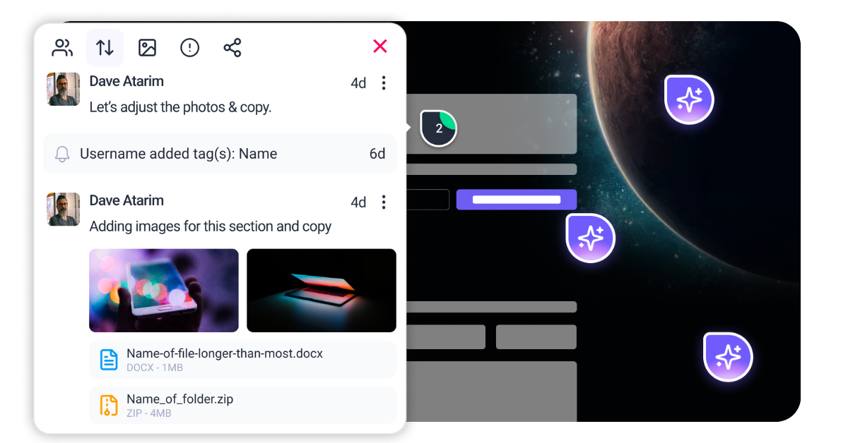
scheduler.yield() (or setTimeout in older codebases) to pause execution, allowing the browser to paint the first frame of the menu opening, then resume the rest of the logic.
Example:
async function openMenu() {
  // Critical: Show the visual state immediately
  document.body.classList.add('menu-open');

  // Yield to main thread to let the browser paint the update
  await scheduler.yield();

  // Now run the expensive background logic
  loadMenuAnalytics();
  hydrateMenuWidgets();
}aspect-ratio. This tells the browser exactly how much vertical space to reserve based on the width, even before the image downloads.
Example:
.hero-image {
  width: 100%;
  height: auto;
  aspect-ratio: 16 / 9; /* Reserves space immediately */
  background-color: #f0f0f0; /* distinct placeholder */
}min-height on the container div so the space is claimed before the ad script runs. <picture> tag with srcset and sizes. Serve images in AVIF format, which offers superior compression to WebP.
Example:
<picture>
  <source srcset="hero-mobile.avif" type="image/avif" media="(max-width: 600px)">
  <source srcset="hero-desktop.avif" type="image/avif">
  <img src="hero-fallback.jpg" alt="Hero Image" width="1200" height="600">
</picture>.nav-link {
padding: 12px; /* Increases hit area */
display: inline-block;
min-width: 44px; /* Apple/Google recommended minimum */
min-height: 44px;
}@media (pointer: coarse)) to apply these larger targets specifically to touch devices without affecting the desktop design. <dialog> element for native accessibility support. @media (max-width: 600px)) are the old way of thinking. They rely on the viewport size. In 2026, modern layouts use Container Queries (@container) to allow individual components to adapt based on the space they have available within their parent element.
In practice, this allows you to build a single “Product Card” component. If placed in a wide desktop grid, it shows a horizontal layout. If placed in a narrow mobile feed (or a sidebar), it automatically snaps to a vertical layout. This is superior for mobile optimization because it decouples the component from the screen size, preventing layout breakages on complex foldable devices.
Implementation:
.card-container {
  container-type: inline-size;
}

@container (max-width: 400px) {
  .card-content {
    flex-direction: column;
  }
}<link rel="prefetch">, this API is smart. You can set it to “moderate” eagerness, meaning it will start prerendering a page as soon as a user touches the screen (on pointerdown), before they even lift their finger (pointerup). By the time the click registers, the next page is already loaded in memory. This makes multi-page websites feel like instant Single Page Apps (SPAs).
Implementation:
<script type="speculationrules">
{
  "prerender": [
    {
      "source": "document",
      "where": {
        "and": [
          { "href_matches": "/*" },
          { "not": { "href_matches": "/logout" } }
        ]
      },
      "eagerness": "moderate"
    }
  ]
}
</script>Save-Data header or Device-Memory API, you can conditionally load heavy JavaScript. If a user is on a low-end device or has “Data Saver” enabled, you serve a version of the site without autoplay videos or heavy animation libraries.
Implementation:
if (navigator.deviceMemory && navigator.deviceMemory < 4) {
  // Load lightweight static comments
  loadStaticComments();
} else {
  // Load heavy interactive comment widget
  loadInteractiveWidget();
}


| Cookie | Duration | Description |
|---|---|---|
| __stripe_mid | 1 year | This cookie is set by Stripe payment gateway. This cookie is used to enable payment on the website without storing any patment information on a server. |
| __stripe_sid | 30 minutes | This cookie is set by Stripe payment gateway. This cookie is used to enable payment on the website without storing any patment information on a server. |
| cookielawinfo-checkbox-advertisement | 1 year | The cookie is set by GDPR cookie consent to record the user consent for the cookies in the category "Advertisement". |
| cookielawinfo-checkbox-analytics | 11 months | This cookie is set by GDPR Cookie Consent plugin. The cookie is used to store the user consent for the cookies in the category "Analytics". |
| cookielawinfo-checkbox-functional | 11 months | The cookie is set by GDPR cookie consent to record the user consent for the cookies in the category "Functional". |
| cookielawinfo-checkbox-necessary | 11 months | This cookie is set by GDPR Cookie Consent plugin. The cookies is used to store the user consent for the cookies in the category "Necessary". |
| cookielawinfo-checkbox-others | 11 months | This cookie is set by GDPR Cookie Consent plugin. The cookie is used to store the user consent for the cookies in the category "Other. |
| cookielawinfo-checkbox-performance | 11 months | This cookie is set by GDPR Cookie Consent plugin. The cookie is used to store the user consent for the cookies in the category "Performance". |
| elementor | never | This cookie is used by the website's WordPress theme. It allows the website owner to implement or change the website's content in real-time. |
| PHPSESSID | session | This cookie is native to PHP applications. The cookie is used to store and identify a users' unique session ID for the purpose of managing user session on the website. The cookie is a session cookies and is deleted when all the browser windows are closed. |
| viewed_cookie_policy | 11 months | The cookie is set by the GDPR Cookie Consent plugin and is used to store whether or not user has consented to the use of cookies. It does not store any personal data. |
| wordpress_test_cookie | session | This cookie is used to check if the cookies are enabled on the users' browser. |
| Cookie | Duration | Description |
|---|---|---|
| aka_debug | session | This cookie is set by the provider Vimeo.This cookie is essential for the website to play video functionality. The cookie collects statistical information like how many times the video is displayed and what settings are used for playback. |
| bp_user-registered | 13 years 8 months 8 days | This cookie is used to set which users can access the private pages of the website. It is a functional cookie. |
| bp_user-role | 13 years 8 months 8 days | This is a functional cookie. It is used to set restriction to the user on acessing certain pages like back office, account page etc. |
| bp_ut_session | 13 years 8 months 8 days | This is a functional cookie. This cookie is used to set restriction to the user on acessing certain pages like back office, account page etc. |
| player | 1 year | This cookie is used by Vimeo. This cookie is used to save the user's preferences when playing embedded videos from Vimeo. |
| Cookie | Duration | Description |
|---|---|---|
| _fs | 16 years 4 months 18 days 5 hours 26 minutes | This cookie is provided by Google Tag Manager. This cookie is used for collecting information on user preferences and the behaviour with web campaign content. This is used by website owners for promoting products and events. |
| Cookie | Duration | Description |
|---|---|---|
| _ga | 2 years | This cookie is installed by Google Analytics. The cookie is used to calculate visitor, session, campaign data and keep track of site usage for the site's analytics report. The cookies store information anonymously and assign a randomly generated number to identify unique visitors. |
| _gat_gtag_UA_187048114_1 | 1 minute | This cookie is set by Google and is used to distinguish users. |
| _gid | 1 day | This cookie is installed by Google Analytics. The cookie is used to store information of how visitors use a website and helps in creating an analytics report of how the website is doing. The data collected including the number visitors, the source where they have come from, and the pages visted in an anonymous form. |
| _hjAbsoluteSessionInProgress | 30 minutes | No description available. |
| _hjFirstSeen | 30 minutes | This is set by Hotjar to identify a new user’s first session. It stores a true/false value, indicating whether this was the first time Hotjar saw this user. It is used by Recording filters to identify new user sessions. |
| _hjid | 1 year | This cookie is set by Hotjar. This cookie is set when the customer first lands on a page with the Hotjar script. It is used to persist the random user ID, unique to that site on the browser. This ensures that behavior in subsequent visits to the same site will be attributed to the same user ID. |
| _hjIncludedInPageviewSample | 2 minutes | No description available. |
| CONSENT | 16 years 4 months 18 days 5 hours 24 minutes | These cookies are set via embedded youtube-videos. They register anonymous statistical data on for example how many times the video is displayed and what settings are used for playback.No sensitive data is collected unless you log in to your google account, in that case your choices are linked with your account, for example if you click “like” on a video. |
| vuid | 2 years | This domain of this cookie is owned by Vimeo. This cookie is used by vimeo to collect tracking information. It sets a unique ID to embed videos to the website. |
| Cookie | Duration | Description |
|---|---|---|
| _fbp | 3 months | This cookie is set by Facebook to deliver advertisement when they are on Facebook or a digital platform powered by Facebook advertising after visiting this website. |
| fr | 3 months | The cookie is set by Facebook to show relevant advertisments to the users and measure and improve the advertisements. The cookie also tracks the behavior of the user across the web on sites that have Facebook pixel or Facebook social plugin. |
| IDE | 1 year 24 days | Used by Google DoubleClick and stores information about how the user uses the website and any other advertisement before visiting the website. This is used to present users with ads that are relevant to them according to the user profile. |
| test_cookie | 15 minutes | This cookie is set by doubleclick.net. The purpose of the cookie is to determine if the user's browser supports cookies. |
| VISITOR_INFO1_LIVE | 5 months 27 days | This cookie is set by Youtube. Used to track the information of the embedded YouTube videos on a website. |
| YSC | session | This cookies is set by Youtube and is used to track the views of embedded videos. |
| yt-remote-connected-devices | never | These cookies are set via embedded youtube-videos. |
| yt-remote-device-id | never | These cookies are set via embedded youtube-videos. |
| yt.innertube::nextId | never | These cookies are set via embedded youtube-videos. |
| yt.innertube::requests | never | These cookies are set via embedded youtube-videos. |
| Cookie | Duration | Description |
|---|---|---|
| _bento_session | 7 days | No description |
| bento_events | 17 hours | No description |
| bento_visit_id | 5 hours | No description |
| bento_visitor_id | session | No description |
| GetLocalTimeZone | session | No description |
| gist_id_jquk4gak | 1 year | No description |
| gist_identified_jquk4gak | 1 year | No description |
| gscs | never | No description available. |
| jilt_customer_session_id | never | No description available. |
| jilt_utm | 7 days | No description |
| loglevel | never | No description available. |
| m | 2 years | No description available. |
| sync_active | never | No description available. |
| undefined | never | No description available. |
| wordpress_87c01d6ccf9faf56036dce5d241c08ac | past | No description |
| wordpress_logged_in_87c01d6ccf9faf56036dce5d241c08ac | past | No description |
| wordpress_sec_87c01d6ccf9faf56036dce5d241c08ac | past | No description |
| wordpresspass_87c01d6ccf9faf56036dce5d241c08ac | past | No description |
| wordpressuser_87c01d6ccf9faf56036dce5d241c08ac | past | No description |
| wp-postpass_87c01d6ccf9faf56036dce5d241c08ac | past | No description |
| wp-settings-0 | past | No description |
| wp-settings-time-0 | past | No description |