
A new headline feature, a brand discovery system that learns your client’s look, a long polish pass on the AI review flow, and a dark mode you can finally use at 2am without your retinas filing a complaint.
This is a big one, so we have pulled the highlights (thank you, Vito, for the heroic list) and we are walking you through the changes that actually move your day. The complete blow-by-blow, every last fix, lives in the full changelog over on Atarim Labs.
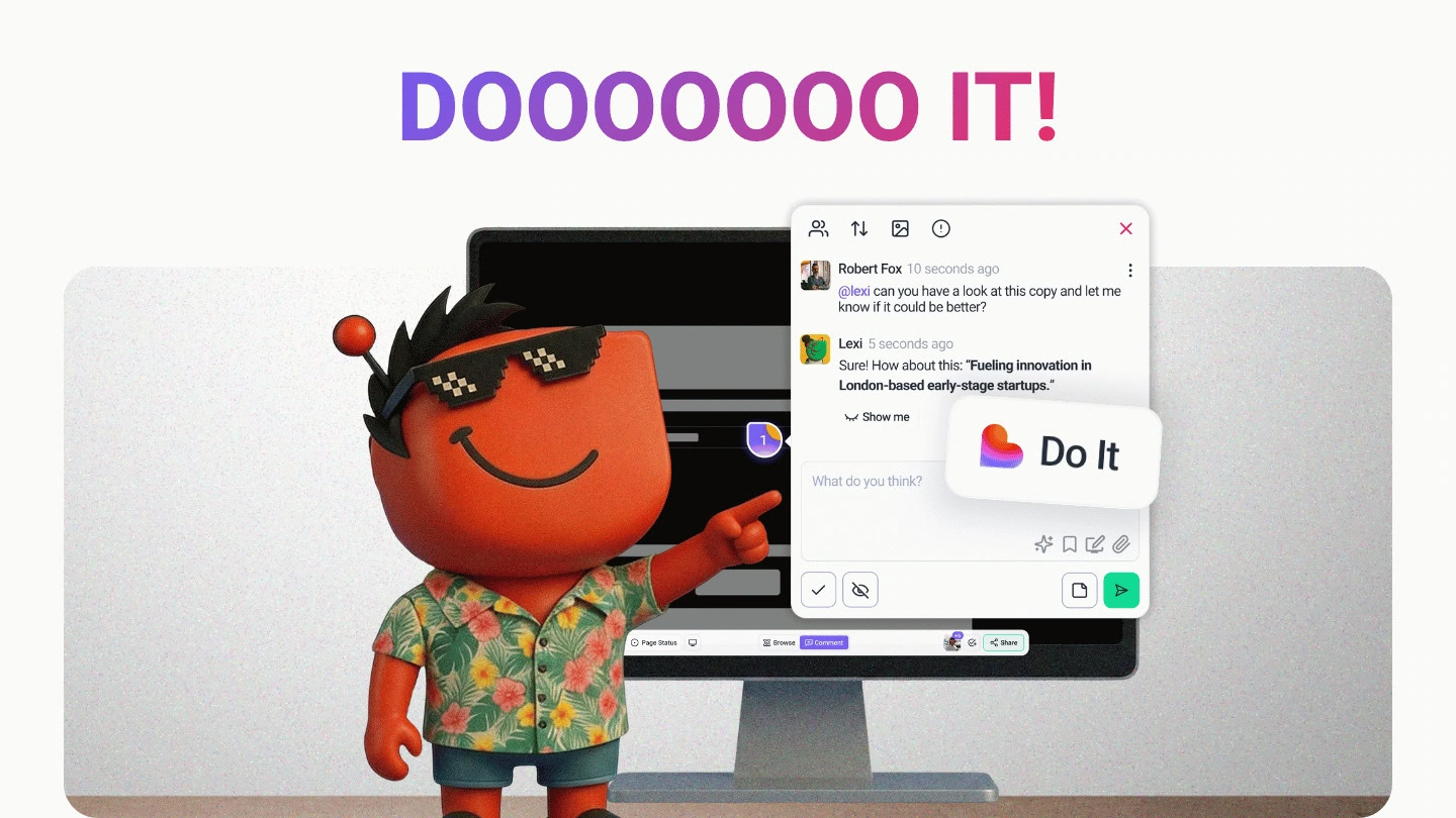
The headline, if you read nothing else: there is a button that takes a problem the AI just found and actually does something about it.
We called it “Do It”, because naming things is hard and honesty is easy.
🚀 The “Do It” Button: from “here’s what’s wrong” to “consider it handled”
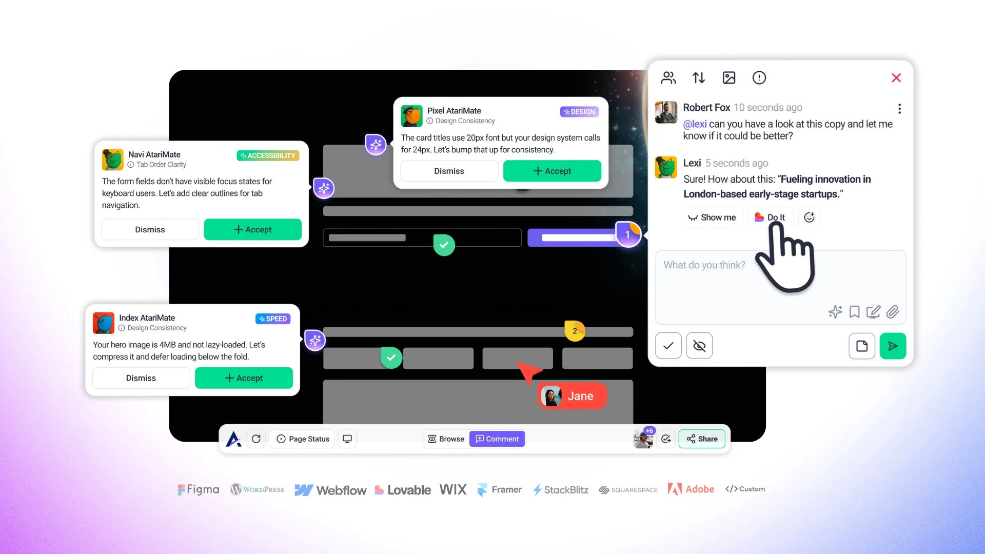
What it is: Claro finds the issues on a page, and now a single “Do It” action turns that finding into actioned work, WordPress and all. If the site isn’t a WordPress project yet, a modal walks you through adding it on the spot, so nothing stalls.
Why it matters: This is the gap we have been chipping away at for months. An AI review that spots fourteen problems is… interesting.
An AI review that spots fourteen problems and hands you a one-click path to dealing with them is the thing you actually wanted. The review stops being a report you act on later and becomes the first step of the work itself.
It is the change we are most proud of in this whole batch.
✨ Brand Discovery: Atarim learns your client’s look, once
What it is: Brand discovery is now wired into the onboarding wizard, project settings, and the AI itself. Atarim identifies a project’s brand identity and carries it through the work, so Pixel has something real to design against instead of guessing.
Why it matters: Every new project used to start from zero on the one thing that should have been obvious from the start: what the brand actually looks like. Now the colours, the identity, and the feel get picked up early and applied across the project, so the AI’s suggestions land closer to on-brand the first time.
How to use it:
- Set it during onboarding and let every later review inherit the brand instead of re-explaining it per task.
- Lean on it for client work where “that’s not really our blue” is a sentence you never want to hear again.
You decide who gets the robot
You can now set “AI Mode by Default in Tasks” per user role. Administrators and Team Members get it on by default; Clients and Collaborators get it off. So your clients see the clean, human task view while your team gets the full AI experience, without anyone fiddling with a toggle every session.
Dark mode, finally finished
We shipped dark mode and then went hunting for the last stubborn corners where it wasn’t quite right, a modal here, an analytics panel there. Those are sorted. The whole app respects dark mode properly now, including the analytics panel that was holding out. Your late-night sessions thank you.
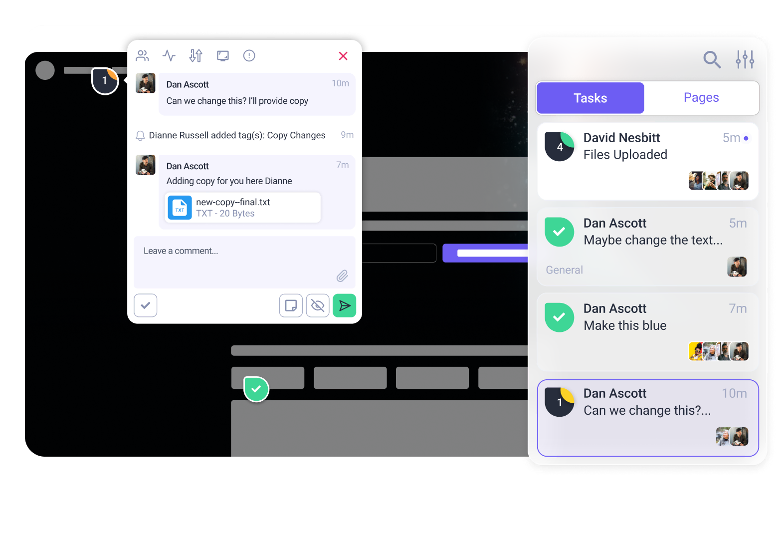
🤝 The AI review flow got a proper polish pass
We put the AI review experience through a long-overdue tidy, the kind of work that never makes a billboard but that you feel on every single review. Glitch has been busy:
- The progress counter tells the truth now. It used to sprint to 100% before Claro had finished talking. It now paces itself across the full review.
- Status and priority live on the task card. You can see the state of a task at a glance in the sidebar without opening it.
- Screenshots work outside Chrome. Firefox, Safari, and the rest now get screenshot previews too, instead of a Chrome-only experience.
- Claro remembers the conversation. AI task chat now reads previous comments as context, so replies are informed by the whole thread rather than starting fresh each time.
- The small stuff: auto-focus on the task input when you create one, auto-scroll to the latest AI reply, a taller response box, smoother comment card animations, and broken images swapped for clean fallbacks.
A review used to feel fiddly. It feels finished now.
Sharper Workflows All Round
A run of upgrades to the bits you touch every day:
- Pin your tasks. Star a task from the sidebar and it stays at the top where you can find it, instead of scrolling for the one that actually matters.
- A proper Figma handoff. After you import from Figma you now land on a next-steps screen with project thumbnails and clear actions, copy the link, open the project, rather than being dropped somewhere and left to work out where your import went.
- WordPress auto-login. Open a WordPress project from the project screen and you’re already authenticated. One fewer login between you and the work.
- Launch a review from a link. AI reviews can now be triggered straight from a URL, so a Slack notification or an email can drop you right into the review that needs you.
- AI tool reports. Export what the AI actually did during a review, so there’s a record of the actions taken rather than a black box.
- Realtime cursors on by default. See your team moving around the page in real time, no setting to flip.
A Permission Worth Knowing About
One fix deserves to be called out on its own: Project Settings is now admin-only. Previously a team member could reach Project Settings they shouldn’t have had access to. That boundary is closed.
In the same vein, collaboration-disabled projects now respect their state, so clients can no longer create new tasks on a project you’ve switched off. Existing tasks stay commentable.
Other Important Fixes
The unglamorous, deeply appreciated pile. Glitch sends regards:
- The auth drop is dead. Navigating between pages in Collaborate no longer silently logged you out and turned you into a Guest User mid-review. This was the big one, and it is fixed.
- You can create more than one task without a refresh. Both in web and in graphics projects. We are as relieved as you are.
- Email settings open again. A nasty one that fully blocked email configuration, now unblocked.
- Collaborate links stop opening to a blank white screen when launched in a new tab with the extension on.
- Forms behave. Notifications go to the right recipients, new fields add without errors, and edit links actually open the form.
- GoDaddy stopped getting emails it never asked for. Sorry about that, GoDaddy.
- Figma sharing lands in the right place. No more empty screens or wrong-workspace redirects from the widget.
- Faster reviews, lighter servers. Screenshots are captured once per review now instead of twice.
And a genuine thank-you to everyone who reported these. A lot of the list above started life as someone taking thirty seconds to tell us something was broken. That is how it gets fixed. Keep them coming.
What’s Next: V5
Here’s the part we have been itching to talk about.
Everything in this post points the same direction. The AI finds the problem, “Do It” acts on it, brand discovery means it acts in the right voice, and the review polish makes the whole loop feel effortless. Each of these is useful on its own. Together they are a preview.
V5 is almost here. This is the one we have been building toward, the version where the work stops living in a dozen separate steps and starts happening in one place. We are not going to spoil the shape of it today. We would rather show you.
So keep close. Watch your inbox and the community. This is the big one, and you are going to want to be among the first to see it.
Go Have a Look
There’s a lot here, so start with the headliner: log in, run an AI review, and hit “Do It” on something. That single button is the clearest picture of where Atarim is heading.
While you’re at it, make sure your Chrome extension and WordPress plugin are updated so the auto-login, the cross-browser screenshots, and the “Do It” flow all behave as intended. An out-of-date plugin is the one thing standing between you and the good stuff.
For everything we couldn’t fit, plus the roadmap you can vote on, head to Atarim Labs.
That’s the work so far. The next chapter is coming. See you there.