Responsive Testing: Managing Feedback Across Device Breakpoints
Review a site at desktop, tablet, and mobile widths — and leave feedback that records which one you were looking at.
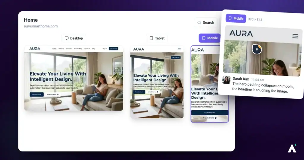
Most feedback is left at whatever width the reviewer’s browser happens to be. That is fine until a client says the navigation is broken and nobody can reproduce it, because they were on a phone and you were not.
Responsive testing fixes that in two ways: you can switch the view to tablet or mobile without leaving Atarim, and any feedback you leave records the width you were viewing at. Atarim frames it as leaving feedback across desktop, tablet, and mobile views so every breakpoint gets the attention it deserves — before it ships.
The three views
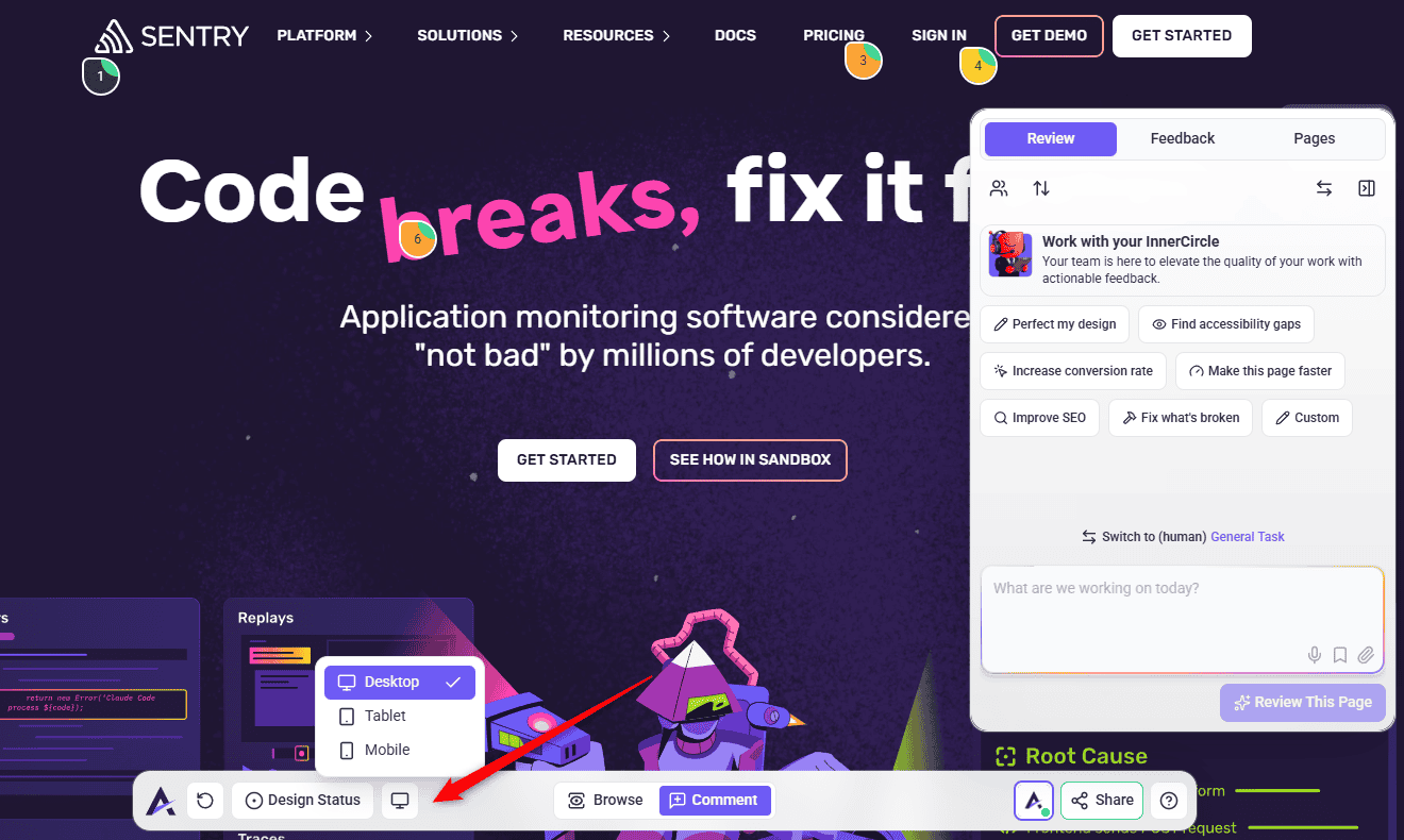
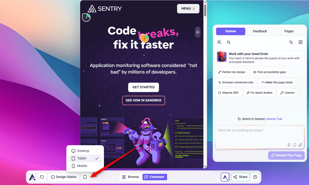
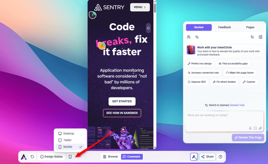
The device menu offers three fixed sizes. They are real dimensions rather than vague labels, which matters when you are checking a specific breakpoint.
| View | Size | Represents |
|---|---|---|
| Desktop | Full window width | However wide your own browser is. The default. |
| Tablet | 768 × 1024 | A standard tablet in portrait. |
| Mobile | 390 × 844 | A modern phone in portrait. |
Key features
Four things make this more useful than simply resizing your browser window.
| Feature | What it gives you |
|---|---|
| Switch view modes | Move between desktop, tablet, and mobile inside Collaborate, without a second tool or a second browser window. |
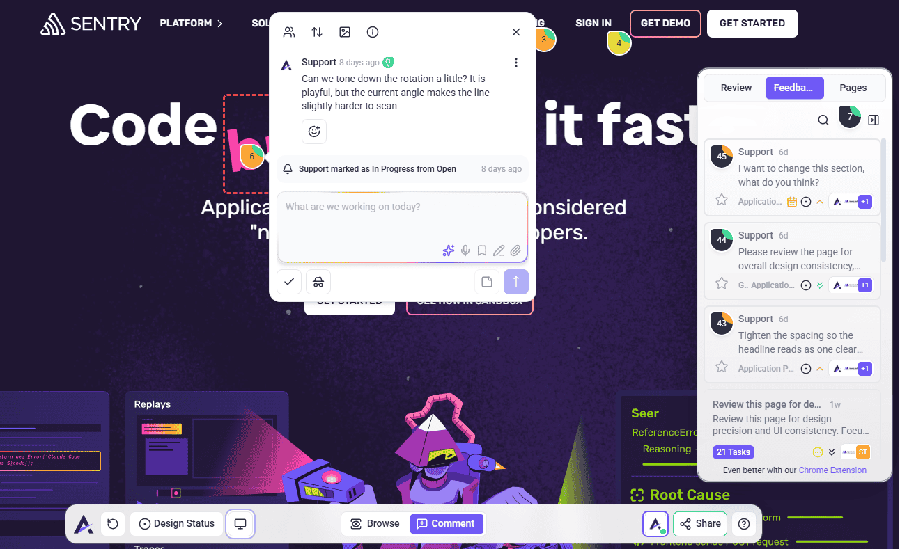
| Comment in context | All the normal feedback tools work at every width. Click an element at mobile size and the task pins to that element. |
| The breakpoint is recorded | Each task stores the screen resolution it was created at, so a developer can tell which layout the feedback is about without asking. |
| One place for everyone | Designers, developers, and clients all review in the same environment, so there is no separate round of mobile feedback to collate. |
Switching between views
The device control sits in the Collaborate bottom bar, next to the other page tools.
Instructions:
Leaving feedback at a breakpoint
This is the part that makes responsive testing worth doing inside Atarim rather than in your browser’s developer tools. The feedback carries the context with it.
Instructions:
Example use cases
Four situations where switching views before signing anything off saves a round of rework.
| Situation | What to do |
|---|---|
| Navigation on tablet | Switch to tablet and check the menu has not collapsed into overlapping text. It is the width most often skipped, because everyone tests desktop and phone. |
| A button label on mobile | Switch to mobile, click the button, and raise the task there. The recorded resolution tells the developer it is not a desktop problem. |
| A client reviewing a new design | Ask them to look at all three views in one session rather than running separate reviews. Their feedback arrives already tagged with the width. |
| Before a page is approved | Check each breakpoint before setting the page to Approved. Sign-off should mean it works everywhere. Explore Page Approvals. |
Why it is worth the extra minute
| Benefit | In practice |
|---|---|
| Fewer irreproducible bugs | The recorded resolution ends the “works on my machine” exchange before it starts. |
| One review instead of three | A client checks all three widths in a single session, so there is no separate mobile round to collate. |
| Problems found earlier | A breakpoint issue caught during review costs a fix; the same issue found after launch costs a fix, a client conversation, and the trust. |
| Feedback that is actionable | Developers get the element, the width, and the browser together, rather than a description they have to interpret. |
Known limitations
Where responsive mode stops:
FAQs
What sizes are the tablet and mobile views?
Tablet renders at 768 × 1024 and mobile at 390 × 844. Desktop uses your full browser width.
Can I set a custom width?
No. The three presets are fixed. For a specific width, use your browser’s developer tools.
Can I check landscape?
Not in Atarim — both smaller views are portrait, with no rotation control.
Does my feedback record which view I was in?
Not directly. Technical Details shows the screen size the task was created at, your browser, who created it, the task ID and the element path — but not which device view you had selected. If the breakpoint matters, say so in the comment.
Can clients use responsive mode?
Yes, in the same Collaborate session. It is the quickest way to get feedback on all three widths in one round.
Is this the same as testing on a real device?
No. It renders your site at that width in your own browser, which catches layout problems but will not surface everything a real phone would.
Do my comments move if the layout shifts?
Tasks are pinned to elements rather than positions, so they follow the element. If a page is rebuilt and the element genuinely changes, a task can be re-pointed using Remap task element.
Common issues
- The device control opens an upgrade panel. Responsive mode is not included on your plan. The panel names the minimum plan required.
- The page looks wrong in tablet or mobile view. That may be the finding. Check it is a genuine layout problem rather than the page still loading, then raise it as a task.
- You cannot rotate to landscape. Not available. Use your browser’s developer tools for landscape checks.
- A developer says they cannot reproduce it. Point them at the task’s Technical Details, which record the resolution the feedback was left at.
- You want a width between the presets. Not available in Atarim. Test the specific width in your browser and raise the task from the nearest preset, noting the width in the comment.
- Clicking navigates instead of commenting. You are in Browse mode. Switch to Comment — this works the same at every width.
Conclusion
Checking three widths takes about a minute and removes an entire category of late surprise. The real gain is not the preview — it is that the feedback you leave carries the breakpoint with it, so a mobile problem arrives on the developer’s list already labelled as one.
Responsive views work alongside every other feedback tool in Collaborate.
Discover The Annotation Tools For Feedback
Tips & best practices
- Check tablet as well as mobile. It is the width most often skipped and where most breakpoint problems hide.
- Say the breakpoint in the comment even though it is recorded — it reads faster in a task list.
- Ask clients to review all three widths in one session rather than running a separate mobile round.
- Check every breakpoint before marking a page approved. Sign-off should mean it works everywhere.
- Annotate spatial problems rather than describing them. Overlaps and cramped spacing are much quicker to show.
- Remember it is a simulation. Confirm anything touch-related on a real device before you call it fixed.