Analytics & Metrics
Measure how fast work moves, where feedback stalls, and how effort is spread across your projects and your team.
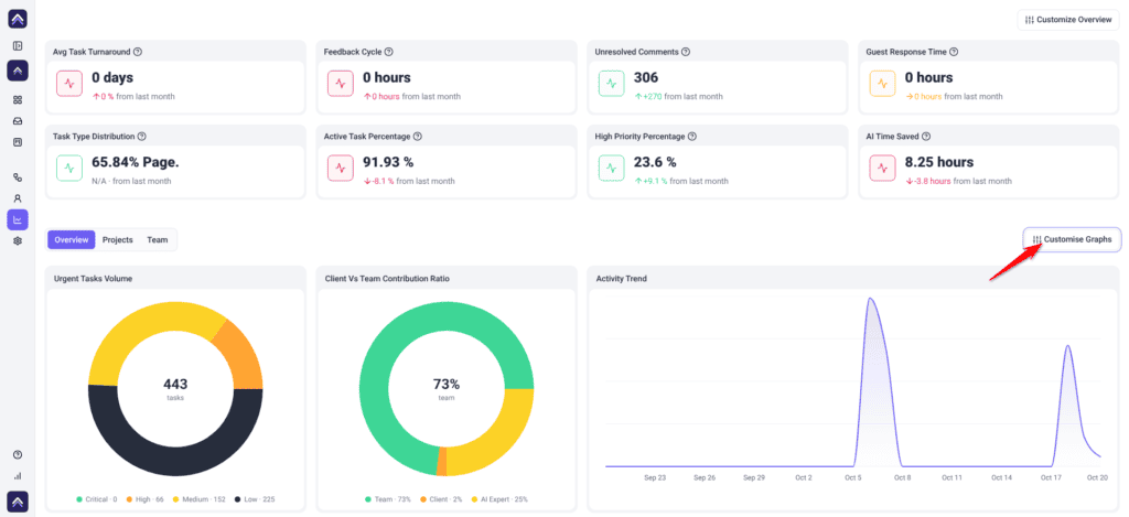
Analytics takes everything recorded across your workspace — tasks created and closed, comments left, approvals given, revisions requested — and turns it into metrics you can act on. It answers the questions that individual tasks cannot: is delivery getting faster, which projects are absorbing the most effort, and is the hold-up on your side or the client’s.
Everything on the screen is scoped to the workspace you are currently in. The Overview covers a rolling 30-day window, while the Projects and Team tables are not limited by date.
Who this is for
Analytics is permission-gated. By default Owners and Administrators see it and Team Members don’t. If your role does not carry analytics access, the item will not appear in your left navigation at all. It isn’t one of the options in Settings → Workspace Permissions, so ask an administrator if you need it.
The metrics themselves cover the whole workspace regardless of who is looking, so anyone with access sees the same figures.
Opening Analytics
Analytics measures your review and delivery process rather than campaign or product outcomes, which is worth knowing before you go looking for either.
Instructions:
- Select Analytics in the left navigation. It sits in the lower group, alongside Workflows, People, and Settings. The screen opens on the Overview tab.
- Choose the tab that matches what you are trying to learn — Overview, Projects, or Team.
| Tab | What it covers |
|---|---|
| Overview | Headline statistics and charts across the entire workspace. |
| Projects | A per-project table covering task volume, progress, and stage. |
| Team | A per-person table covering completed work, open work, and project involvement. |
Narrowing what you see
The Projects and Team tabs each have a picker that narrows that tab’s table. The Overview always covers the whole workspace.
Instructions:
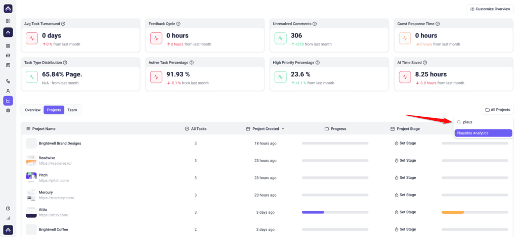
- On the Projects tab, open the project picker, which defaults to All Projects. A searchable list opens — type into Search projects… to find one quickly; if nothing matches you will see “No projects found.”
- Select a project to narrow the table to that project, or leave it on All Projects.
- On the Team tab, open the people picker, which defaults to All Users, and select a person to show only their row. It works the same way, with a Search users… box and a “No users found.” empty state.
Choosing which metrics appear
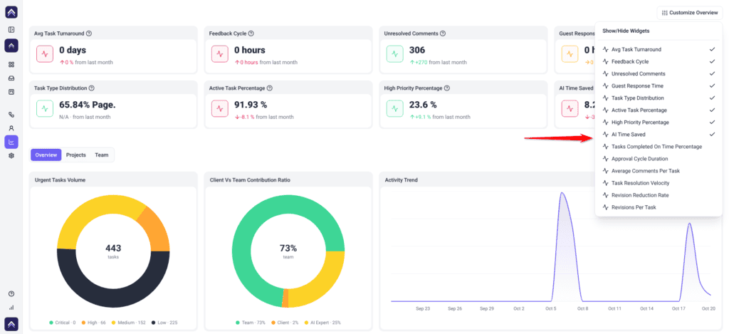
The Overview tab is built from two independent sets — statistic tiles across the top, and charts below — each with its own visibility menu. On a desktop screen, the tiles also stay at the top when you switch to the Projects or Team tab.
Instructions:
- Select Customize Overview at the top right of the screen. A dropdown opens headed Show/Hide Widgets, listing every available statistic tile with a toggle.
- Toggle tiles on or off. The grid updates immediately.
- Select Customise Graphs for the chart equivalent. A dropdown opens headed Show/Hide Charts. This control only appears on the Overview tab.
The statistic tiles
Eight tiles are shown by default:
| Tile | What it measures | Why it matters |
|---|---|---|
| Avg Task Turnaround | Average time from a task being created to being completed. | The single clearest read on delivery speed. |
| Feedback Cycle | Average time, in hours, from a task being created to its first comment. | A rising figure means new tasks wait longer for a first response. |
| Unresolved Comments | Comments still awaiting a response or resolution. | Shows where conversations have been left hanging. |
| Guest Response Time | Average time, in hours, before a task gets its first reply. | |
| Task Type Distribution | The mix of task types across the workspace. | Shows what your team actually spends its time on. |
| Active Task Percentage | Proportion of tasks currently active. | A quick read on how much is genuinely in motion. |
| High Priority Percentage | Proportion of tasks marked high priority. | A persistently high figure means prioritization has stopped meaning anything. |
| AI Time Saved | Estimated time your team saved through AI reviews. | Shows how much review work AI is taking off your plate. |
Six more can be switched on from Customize Overview:
| Tile | What it measures |
|---|---|
| Tasks Completed On Time Percentage | Proportion of tasks finished by their due date. |
| Approval Cycle Duration | Average time from a page becoming reviewable to being approved. |
| Average Comments Per Task | How much discussion each task generates. |
| Task Resolution Velocity | How quickly tasks move from created to completed. |
| Revision Reduction Rate | Comments per task this period compared against the previous one. |
| Revisions Per Task | Average comment activity per task, a guide to revision load. |
The charts
Six charts show by default. Switch on Most Active Projects from Customise Graphs.
| Chart | What it shows |
|---|---|
| Top Active Collaborators | Who is contributing most across the workspace. |
| Tasks Per User | Tasks not yet complete, assigned to each person. |
| Inner Circle Participation | Participation levels within your core group. |
| Activity Trend | Daily activity from comments and tasks across the period. |
| Urgent Tasks Volume | Tasks not yet complete, split by priority. |
| Client Vs Team Contribution Ratio | How tasks and comments split between your team, your clients and AI experts. |
| Most Active Projects | Which projects are generating the most activity. |
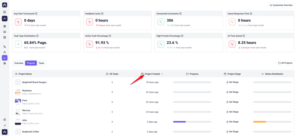
The Projects tab
A table with one row per project:
| Column | What it shows |
|---|---|
| Project Name | The project the row refers to. |
| All Tasks | Total task count on that project. |
| Project Created | When the project was added. |
| Progress | How far through the work the project is. |
| Project Stage | The stage the project currently sits in. |
| Status Distribution | How that project’s tasks are spread across statuses. |
Project stages can be opened directly from this table, so you can review and change where a project sits without leaving Analytics.
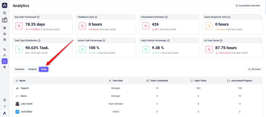
The Team tab
| Column | What it shows |
|---|---|
| Name | Each person in the workspace. |
| User Role | Their role in the workspace. |
| Tasks Completed | How many tasks they have finished. |
| Open Tasks | How many are still outstanding. |
| Associated Projects | How many active projects they are on. |
Known limitations
- There is no export. Figures cannot be downloaded from the dashboard, so client reporting means capturing them manually.
- The Overview period is fixed at the last 30 days. There is no date range control, so you cannot widen, narrow, or shift the window.
- Nothing spans workspaces. Every figure covers the current workspace only.
- You cannot add custom metrics. Tiles and charts can be shown or hidden, but the set itself is fixed.
- Analytics does not include time tracking. Logged hours are not part of these metrics.
FAQs
Can I export analytics for a client report?
Not from the dashboard. There is no export control at present, so figures need capturing manually.
What period do these figures cover?
The Overview tiles and most charts cover a rolling 30-day window ending today, and the window cannot be changed. Tasks Per User and Urgent Tasks Volume show every task that is not yet complete. The Projects and Team tables are not limited to 30 days.
Can I compare this month against last month?
Only where a tile does it for you. Several metrics compare the current 30 days against the previous 30 and show the direction of travel — Revision Reduction Rate is the clearest example. There is no manual period selector.
Does Analytics include time tracking or logged hours?
No. These metrics are built from task and collaboration activity, not from logged time.
Can I add my own metric?
No. You can show or hide what Atarim provides, but the set is fixed.
Do my widget choices affect what my colleagues see?
No. Showing and hiding tiles and charts changes your own view of the Overview tab.
Why does a team member show no completed tasks?
Check whether their work sits in another workspace.
Does Analytics cover every project or only active ones?
The Projects table lists the active projects in your current workspace. Archived projects are left out. To see one project on its own, use the project picker on the Projects tab.
Common issues
- Analytics is missing from the sidebar. Your role does not carry analytics access. It isn't set in Settings → Workspace Permissions, so ask an administrator about your role.
- Figures look far too low. The Overview covers only the last 30 days. On the Projects or Team tab, check the picker isn't set to one project or person.
- A tile or chart you used before has gone. It has been toggled off. Check Customize Overview and Customise Graphs.
- Numbers differ from another workspace. Expected. Nothing aggregates across workspaces.
- A metric shows nothing at all. There may be no qualifying activity in the last 30 days. The window is rolling, so older work drops out of the figures.
- Figures dropped after a quiet period. Expected. The 30-day window moves with the calendar, so a slow fortnight pulls averages down even if nothing changed about how you work.
- You cannot find an export button. There isn’t one. Capture the figures manually.
Conclusion
Analytics is most useful read as a trend rather than a scoreboard. Turnaround, feedback cycles, and revisions tell you whether your process is improving, and the Client Vs Team Contribution Ratio shows who is doing the talking. Check it on a regular rhythm, and the changes will mean something.
Learn About Activity Tracking and Reporting
Tips & best practices
- Pick a fixed day each month to review Analytics. The window is a rolling 30 days, so reviewing on the same date is what makes your own records comparable.
- Screenshot the Overview at the end of each month. With no export, that is the only record you will have of where things stood.
- Check the picker on the Projects or Team tab before reading the table. A leftover pick is the most common cause of a table that looks wrong.
- Use the Team tab to spot uneven workload, not to rank people. Task counts say nothing about task size.
- If High Priority Percentage stays high, the problem is prioritization rather than capacity.